| Man City's new "Blue Peter" badge |
| View previous topic :: View next topic |
| Author |
Message |
Pete’s Picture Palace
Forum Moderator

Joined: 19 Feb 2013
Posts: 4270
Location: Wallington Surrey

|
 Posted: Thu Dec 24, 2015 5:24 pm Posted: Thu Dec 24, 2015 5:24 pm
Post subject: Man City's new "Blue Peter" badge |
 |
|
This made me smile......
http://www.bbc.co.uk/sport/0/football/35175829
Won't be long before my lot go down that route now with all those dollars flooding in. |
|
| Back to top |
|
 |
hydemaine
Joined: 17 May 2009
Posts: 651
|
|
| Back to top |
|
|
Dorking

Joined: 05 Feb 2010
Posts: 2512
|
Posted: Thu Dec 24, 2015 6:56 pm
Post subject: |
|
|
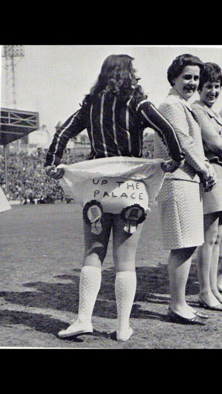
City (and Palace) legend Malcolm Allison chose it as you well know 
Doesn't look too dissimilar to what they had in the 1980's, just dropped the F.C. really, which is a shame |
|
| Back to top |
|
|
charliemitten
Joined: 05 Nov 2015
Posts: 28
|
Posted: Thu Dec 24, 2015 7:05 pm
Post subject: Badge |
|
|
I notice they have dropped F.C. or Football Club and the word CITY is linear
and not arched like the word Manchester. I think this is branding because
MCFC are known as 'City' whilst United are referred to as 'Manchester'
abroad.
United also dropped Football Club around 1972 for the same reason. |
|
| Back to top |
|
|
littlewiggy

Joined: 07 Apr 2013
Posts: 1810
Location: Newport
|
Posted: Thu Dec 24, 2015 7:08 pm
Post subject: |
|
|
I like it, it looks more traditional than the monstrosity they've sported this past few years.
I didn't like the modern, post-90s Liverpool crest either, with the Shankly Gates and Hillsborough flames, looks much nicer now with the plain yellow Liverbird and understated "LFC."
It's a cliche, but less is often more. |
|
| Back to top |
|
|
hydemaine
Joined: 17 May 2009
Posts: 651
|
Posted: Thu Dec 24, 2015 7:19 pm
Post subject: |
|
|
| Dorking wrote: |
City (and Palace) legend Malcolm Allison chose it as you well know
Doesn't look too dissimilar to what they had in the 1980's, just dropped the F.C. really, which is a shame |
The eagle is said to be a traditional symbol of the city of Manchester, since a golden eagle was featured in the city’s official badge in 1958. Well before
Malcolm Allison arrived.
What Malcolm Allison did have input in was the European red and black striped shirt which he thought would make City stand out more and be like AC Milan's kit for European games it evolved into the away kit from the late 1960's. |
|
| Back to top |
|
|
bobholl29

Joined: 30 Apr 2009
Posts: 103
Location: Stockport
|
Posted: Thu Dec 24, 2015 9:14 pm
Post subject: Man City's new "Blue Peter" badge |
|
|
The new badge suits the club very well.
It has no backbone, no style and lacks direction |
|
| Back to top |
|
|
Pete’s Picture Palace
Forum Moderator
Joined: 19 Feb 2013
Posts: 4270
Location: Wallington Surrey
|
Posted: Thu Dec 24, 2015 9:25 pm
Post subject: |
|
|
I think Dorking meant that Big Mal chose the eagle for Palace (to replace the Glaziers).
And the colours, and the width of the pitch (which lasted one game as we lost 4-1 to Notts Co). And the nicknames he gave to players to wear on their tracksuits (that lasted about 3 weeks). And the iconic sash shirt which he also borrowed from City.


At Palace the colours and the proud eagle remain. The sash shirt is a fans' favourite and makes regular reappearances. No doubt the eagle will become bald with American influence. |
|
| Back to top |
|
|
Dorking
Joined: 05 Feb 2010
Posts: 2512
|
Posted: Thu Dec 24, 2015 9:26 pm
Post subject: |
|
|
| hydemaine wrote: |
| Dorking wrote: |
City (and Palace) legend Malcolm Allison chose it as you well know
Doesn't look too dissimilar to what they had in the 1980's, just dropped the F.C. really, which is a shame |
The eagle is said to be a traditional symbol of the city of Manchester, since a golden eagle was featured in the city’s official badge in 1958. Well before
Malcolm Allison arrived.
What Malcolm Allison did have input in was the European red and black striped shirt which he thought would make City stand out more and be like AC Milan's kit for European games it evolved into the away kit from the late 1960's. |
All very interesting, but I was talking about why Palace have an Eagle, which was simply because Malcolm Allison didn't think 'Glaziers' was exciting enough. |
|
| Back to top |
|
|
Pete’s Picture Palace
Forum Moderator
Joined: 19 Feb 2013
Posts: 4270
Location: Wallington Surrey
|
Posted: Thu Dec 24, 2015 9:27 pm
Post subject: |
|
|
|
|
| Back to top |
|
|
Dorking
Joined: 05 Feb 2010
Posts: 2512
|
Posted: Thu Dec 24, 2015 9:28 pm
Post subject: |
|
|
|
|
| Back to top |
|
|
hydemaine
Joined: 17 May 2009
Posts: 651
|
Posted: Thu Dec 24, 2015 9:41 pm
Post subject: Re: Man City's new "Blue Peter" badge |
|
|
| bobholl29 wrote: |
The new badge suits the club very well.
It has no backbone, no style and lacks direction |
What a terrible club yet your still happy selling their programmes. |
|
| Back to top |
|
|
Jim LFC

Joined: 05 Oct 2014
Posts: 590
|
Posted: Thu Dec 24, 2015 10:28 pm
Post subject: |
|
|
| littlewiggy wrote: |
I didn't like the modern, post-90s Liverpool crest either, with the Shankly Gates and Hillsborough flames, looks much nicer now with the plain yellow Liverbird and understated "LFC."
It's a cliche, but less is often more. |
Totally agree!!  |
|
| Back to top |
|
|
derby1884
Forum Moderator

Joined: 05 Aug 2012
Posts: 3538
Location: the very western edge of Aberdeen
|
Posted: Thu Dec 24, 2015 11:48 pm
Post subject: |
|
|
First thing that struck me on viewing it was that they've revamped it along the lines of the Bayern Munich club crest.
Not that it really matters - all these behemoths are "brands" now, anyway. If the new crest doesn't sell the merchandise, it'll be changed before you know it. _________________ http://www.flickr.com/photos/derby1884/sets/ |
|
| Back to top |
|
|
holtie96
Joined: 30 May 2009
Posts: 2319
|
Posted: Fri Dec 25, 2015 12:23 am
Post subject: Palace |
|
|
Happy Christmas
 [/i] |
|
| Back to top |
|
|
seand
Joined: 07 Jan 2009
Posts: 839
Location: Dublin
|
Posted: Wed Dec 30, 2015 11:29 am
Post subject: |
|
|
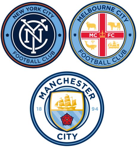
The new crest is grand. It's relatively clean and unfussy and they've got rid of the ridiculous stars over it. I presume the CITY will be curved like the Manchester in the final design, otherwise it's going to look very odd. |
|
| Back to top |
|
|
hydemaine
Joined: 17 May 2009
Posts: 651
|
Posted: Wed Dec 30, 2015 1:18 pm
Post subject: |
|
|
| seand wrote: |
| The new crest is grand. It's relatively clean and unfussy and they've got rid of the ridiculous stars over it. I presume the CITY will be curved like the Manchester in the final design, otherwise it's going to look very odd. |
`Nope that's how it will stay. Their reason that the word CITY will stand out more.
Done for branding purposes we are already known worldwide by pundits and commentators abroad as City and United are known as Manchester.
Not entirely happy but it's a nice design in spite of this.
Also we have lost putting M.C.F.C. on our badge look at Melbourne's design
who are in the City group?
 |
|
| Back to top |
|
|
bisphamseasider

Joined: 02 Jun 2009
Posts: 2732
Location: Blackpool
|
|
| Back to top |
|
|
hydemaine
Joined: 17 May 2009
Posts: 651
|
|
| Back to top |
|
|
|
|
|
You cannot post new topics in this forum
You cannot reply to topics in this forum
You cannot edit your posts in this forum
You cannot delete your posts in this forum
You cannot vote in polls in this forum
|
|
|
|
| |
|
|
|
Nice to be nice, 6 minutes ago
Nice to be nice, 6 minutes ago
Nice to be nice, 7 minutes ago
Tynie Topics, 1 day ago
Paul Johnson, 1 day, 23 hours ago
Paul Johnson, 1 day, 23 hours ago
footballprogrammes.com, 2 days, 19 hours ago
Viola19, 3 days, 3 hours ago
smk06, 3 days, 17 hours ago
stfc831968, 4 days ago
Viola19, 4 days, 3 hours ago
Thedoog10, 4 days, 19 hours ago
smk06, 5 days ago
Viola19, 5 days ago
Thedoog10, 5 days, 1 hour ago
sharrowblade, 5 days, 20 hours ago
manchesterunitedman1, 5 days, 21 hours ago
Dorking, 6 days, 4 hours ago
sharrowblade, 6 days, 20 hours ago
BHA1, 6 days, 22 hours ago
Flaming Pie, 1 week ago
Enniskillendoc, 1 week ago
Enniskillendoc, 1 week ago
Dorking, 1 week, 2 days ago
Tynie Topics, 1 week, 2 days ago
hotspur1953, 1 week, 4 days ago
OurManInVanc, 1 week, 5 days ago
Nick Stephens, 1 week, 5 days ago
Js81, 2 weeks ago
coventrynick, 2 weeks ago
EagleRoger, 2 weeks, 1 day ago
Tynie Topics, 2 weeks, 1 day ago
colchestersid, 2 weeks, 2 days ago
PM4PM, 2 weeks, 2 days ago
ndg1860, 2 weeks, 2 days ago
PM4PM, 2 weeks, 2 days ago
Tynie Topics, 2 weeks, 2 days ago
Tynie Topics, 2 weeks, 2 days ago
PM4PM, 2 weeks, 2 days ago
Tynie Topics, 2 weeks, 2 days ago
gregl2020, 2 weeks, 2 days ago
PM4PM, 2 weeks, 2 days ago
Tynie Topics, 2 weeks, 2 days ago
Tynie Topics, 2 weeks, 2 days ago
PM4PM, 2 weeks, 2 days ago
Tynie Topics, 2 weeks, 2 days ago
PM4PM, 2 weeks, 2 days ago
bigdavethemaddog, 2 weeks, 2 days ago
Tynie Topics, 2 weeks, 2 days ago
PM4PM, 2 weeks, 2 days ago |
| |
|
11,822
Members
9,966
Members Wants
39
Members Mini-Stores
4,227
Members Items for Sale
|
| |
|